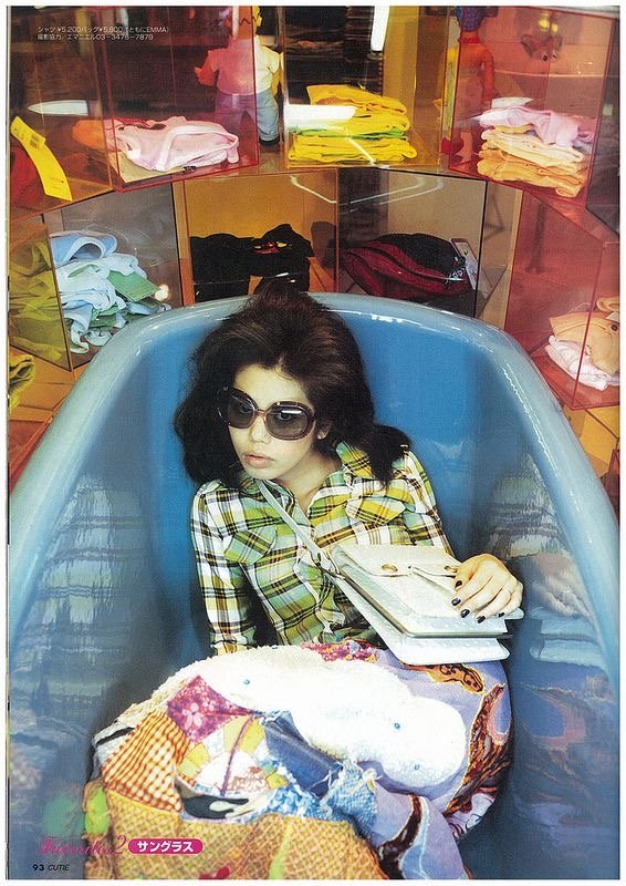
Life is too short to be a minimalist!
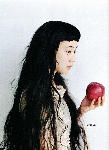
I've always been into creative design, layout, and art direction. I just don't really care for minimalism in any form life is too short; I don’t have a little bit of stuff, and that's exactly how I like my advertisements. I have lately been more drawn to many Japanese advertisements, promotional material, and editorials because everything is done creatively and intentionally. At this point in time, with everything going on in the world, there is definitely a creative drought going on right now.
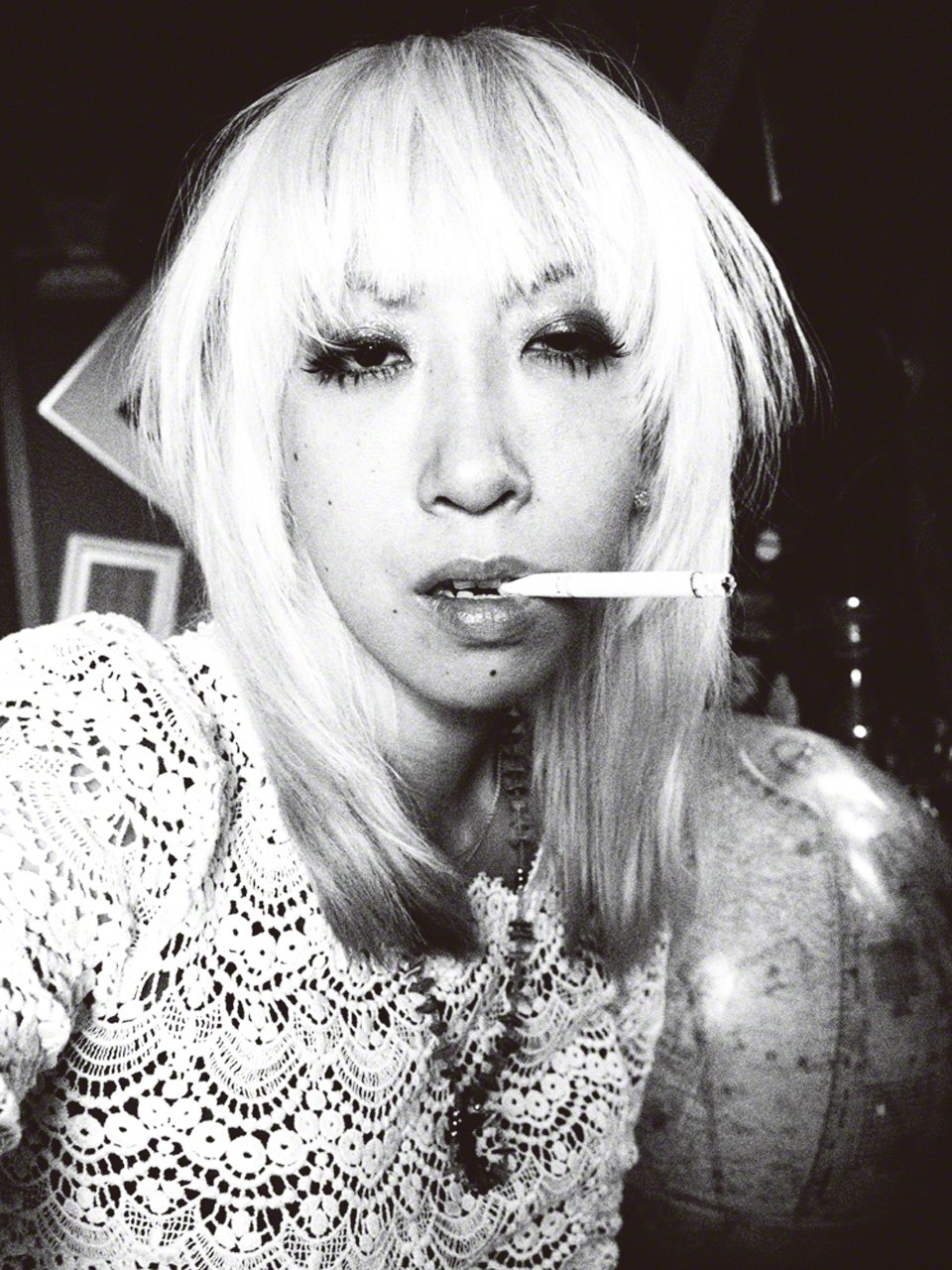
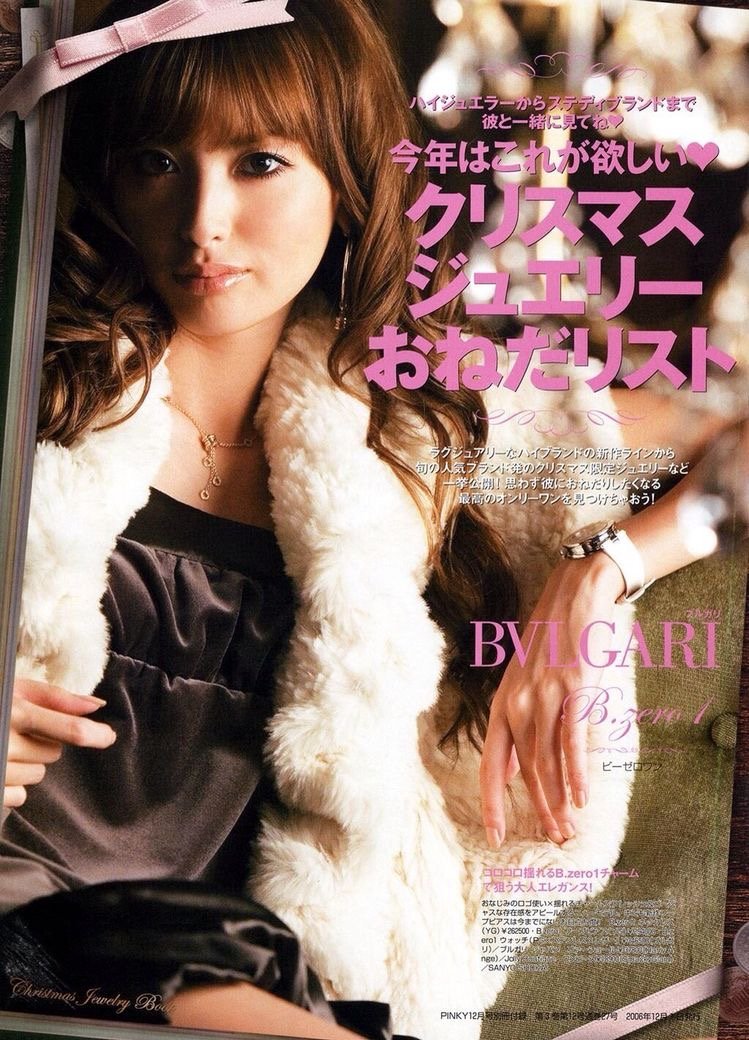
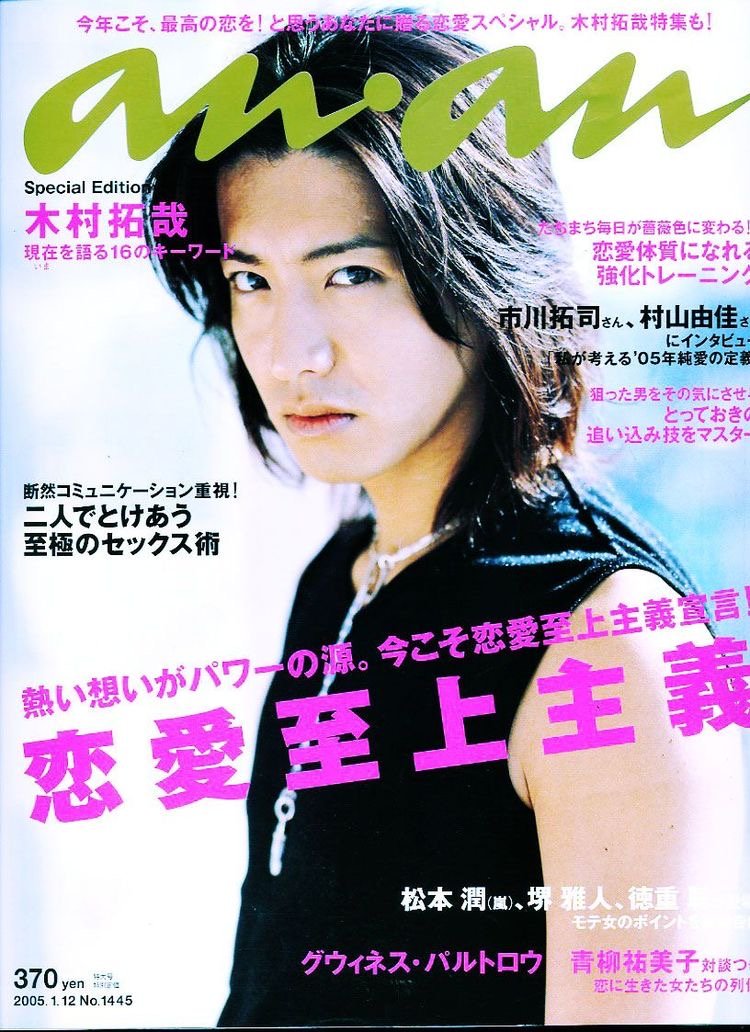
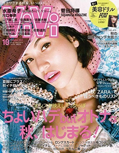
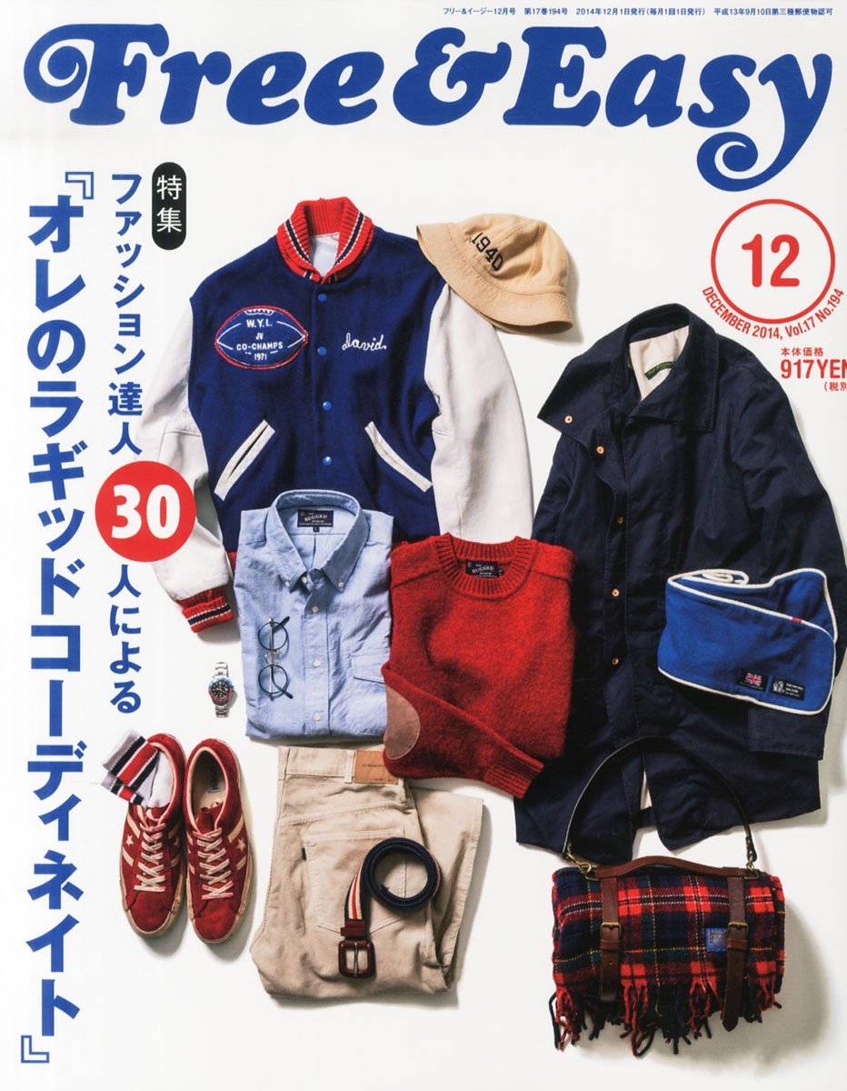
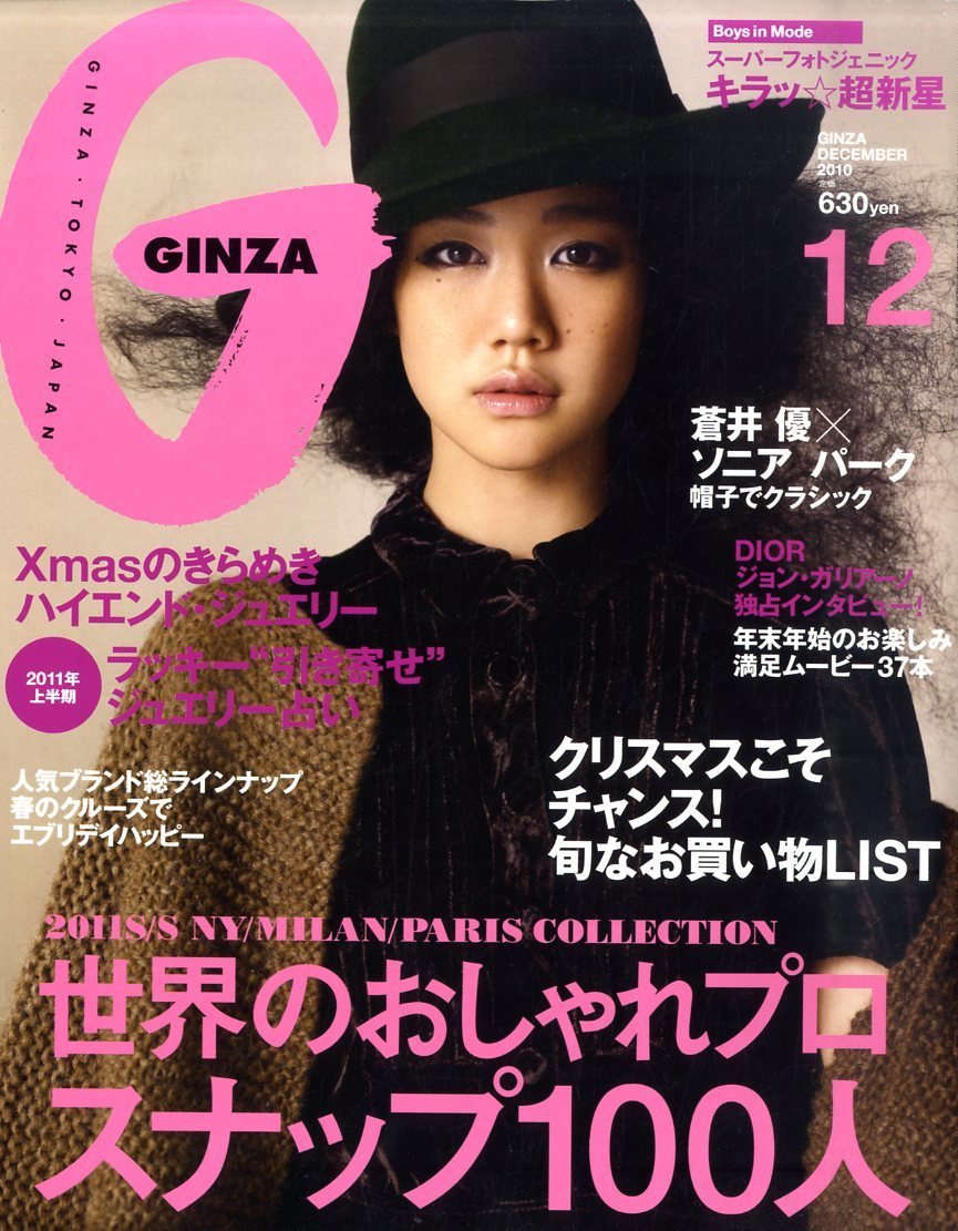
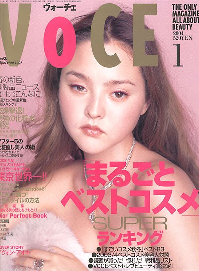
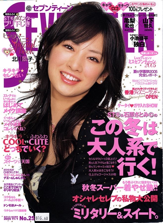
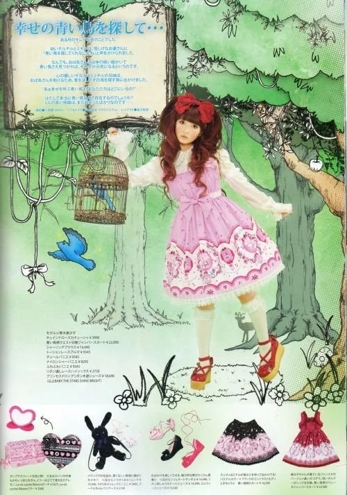
I like Japanese advertising, especially in their magazines such as ViVi, Maquia, Spoon, Hanatsubaki, Zipper, Spring, Free and Easy, Fudge, H, Smart, Boon, etc. The consumer by using creative styling and direction. I'm just not seeing this level of creativity and tact here in America. The way they put their magazine advertisements together is so effortless. Even though it seems like a bunch of stuff is crammed together on one page, it's done effortlessly and with style and tasteful tact. It all comes together so well, don't you think?

I’ve always been into fashion, makeup, art, creative concepts, and art direction. From movies, music, fashion, vinyl figures, books, documentaries, and magazines, these magazines have been a force in influencing my aesthetic choices for practically my whole since middle school. These magazines, along with Tumblr, have influenced how I develop and process my aesthetic decisions and others, making me unique as an individual and creative.

Love a Good Editorial/ Magazine Ad !
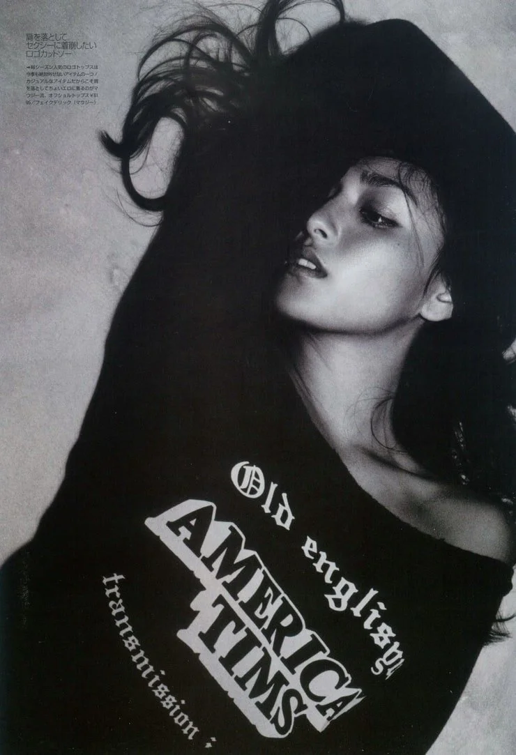
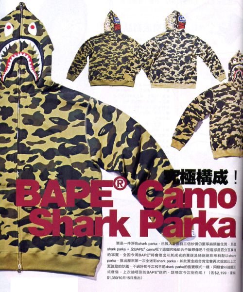
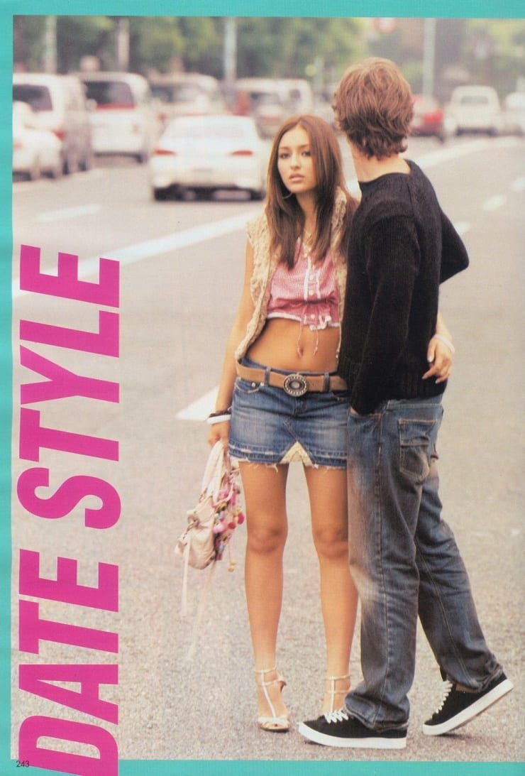
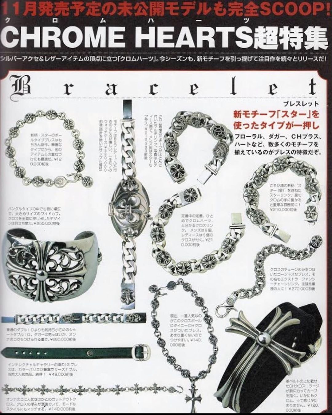
I also appreciate how meticulous magazines are approached in japan is the careful and creative use of fonts to get across whatever the magazine wants to sell to the audience. Is it pink? Is it blue? Is it meant to make the reader feel calm or a rush of energy?
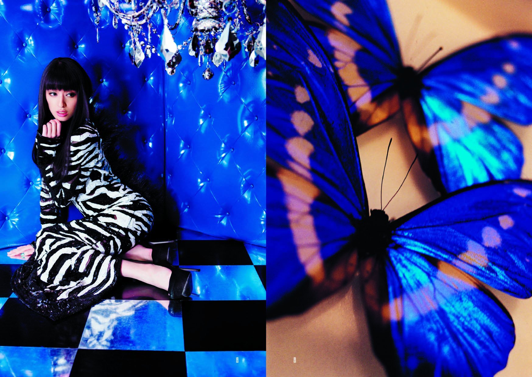
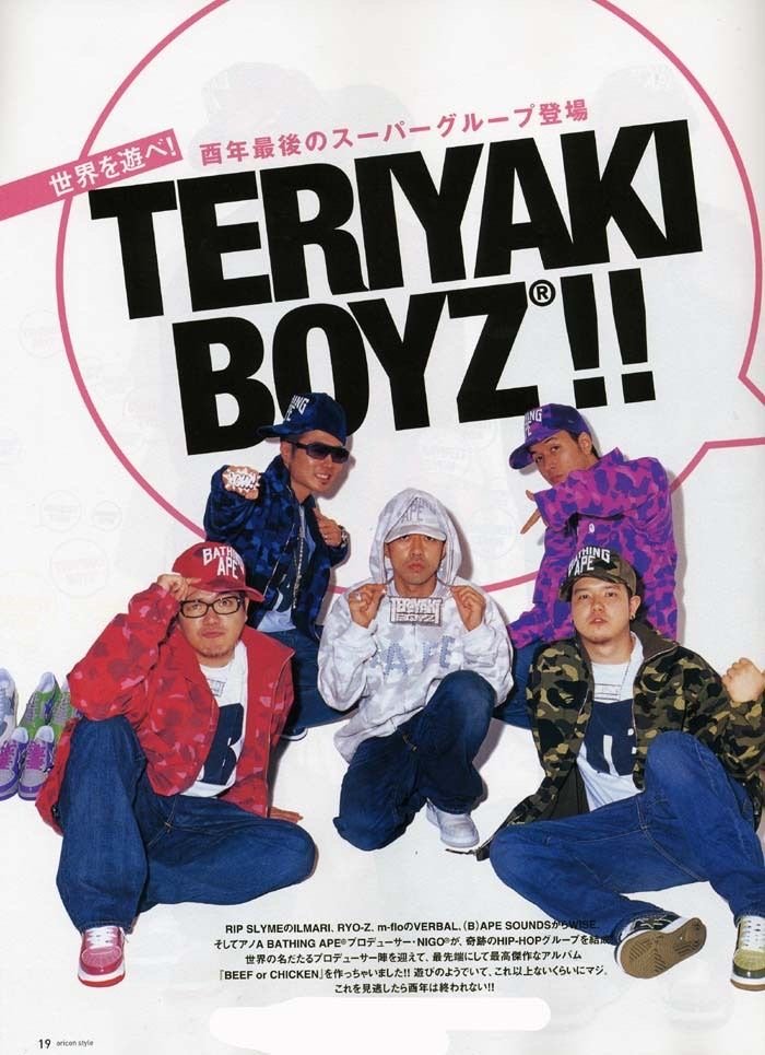
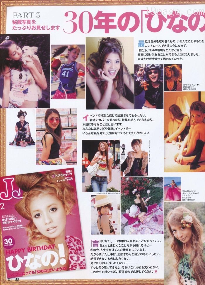
I also love how the editorial will have many different things instead of just one image per page. The images are layered on top of each other like a collage. I definitely appreciate that a lot; it brings the visuals to life, is visually scintillating to the eyes, and draws the consumer in. They take advantage of the page to maximize its total capacity.
Also, the editing tends to be supergood punny phrases. It takes on whatever is sold in a specific way to whatever niche the magazine is, and I genuinely appreciate that. It really does take a team of people to make everything come together, and someday that will be me…of course, after my goals have been met, lol.

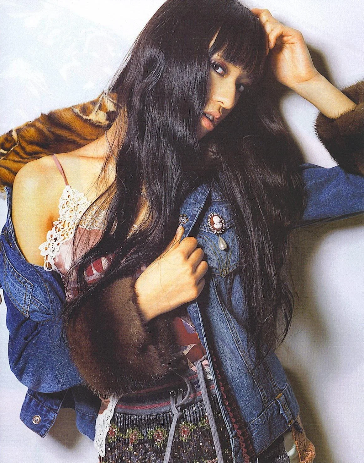
Wild OUT Styled OUT!
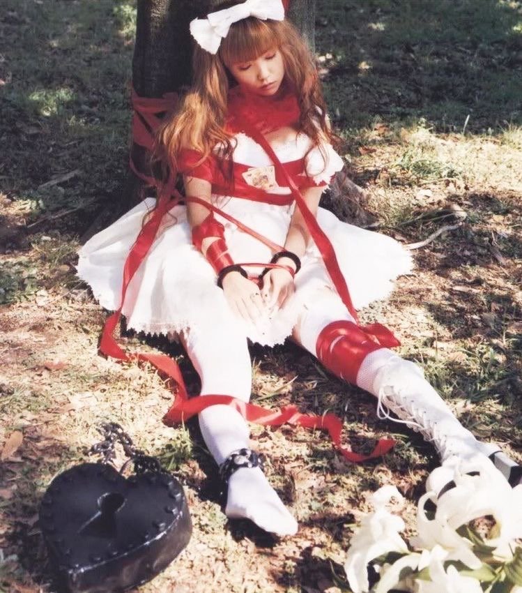
I also appreciate the style direction I find across all Japanese magazines, no matter the niche. The styling helps the editors keep their foot on every neck, which helps contribute to these fantastic fashion-based images that I love. The way a regular outfit can be styled, put together, or incorporated into a typical outfit, I genuinely love it so much it makes everything pop and so much better than if it was worn regularly. I love how creative the styling is and how it really ties the whole shoot together. The model, the editing, the clothes, the styling, and I feel like Japan has a clear cut, distinct, and clean look for their magazines and advertisements production value. I'm always drawing inspiration from the old and the new.







Thank you so much for making it to the end of my article. More creative, visual interest-based content is on the way. I'm super passionate about this type of stuff, so I can't wait to pump out more content based on what I'm passionate about… again, thank you for your support.


